View project
on a larger
device
: )
SMARTY
Scaleable Design System
Tokens
Cross-platform
Code
Branding
Project
Overview
SMARTY are a virtual telco focused on offering simple plans for anyone without a contract. The web and app teams worked in silos and as a result SMARTY's ecosystem became fragmented and this was effecting user experiences and team dynamics.
Project
Overview
Role
Senior Product Designer
Team
Me · 3 Web Designers · 3 App Designers · 4 Developers
Timeline
2 months (rollout of DS 6 months)
Tools
Figma · Relay · ChatGTP · StoryBook


The Impact & Outcome
39% decrease in design and development cycles. (quicker time to GTM).
AA WCAG compliant.
Scalable & flexible design system.
The
Problem
The ecosystem was fragmented.
Web and app teams were siloed.
Developer hand-off was painful and slow.


UI differences between web and app platforms. Fragmentation of the ecosystem.
Measuring
Success
Metrics measured that impact the business:
Design & development cycle time.
Lower incremental cost of product expansion.
Employee satisfaction.
Discovery DS
Best Practices
Week 1
Facing hand-off issues, siloed teams, slow development, and ecosystem fragmentation, we examined design systems from other companies.
Spotify’s Encore stood out for addressing these challenges.
We used its structure to build a foundation library to supply global design tokens to Web, Android, and iOS libraries, ensuring consistency in typography, color, spacing, radius, illustrations, and icons across all our platforms.

The file structure of SMARTY's DS in figma based on Encore.
DS Governance
Week 1
I then outlined with the team how we would govern the new design system.
We did not have enough resource for a dedicated design team so we would assemble when components, tokens and values needed to be added or changed.
We would also run a monthly retros about what was and wasn't working with the design system.
Auditing Current
DS
Week 2
In the second week I focused on auditing the current design systems and identifying components that were similar and different.
The team focused on high-impact components. Buttons, navigation, textfields and cards were prioritised first.
We would meet together everyday to make the executive decision wether take a component forward into the new design system or cut it.
We did this by seeing if a component could be used across all platforms or if it was a just a platform specific component.

Table to track the component audit progress.
Token Structure
Week 3 & 4
Once myself and the team had a good understanding of the components we were taking forward I started to set up the token structure for these components.
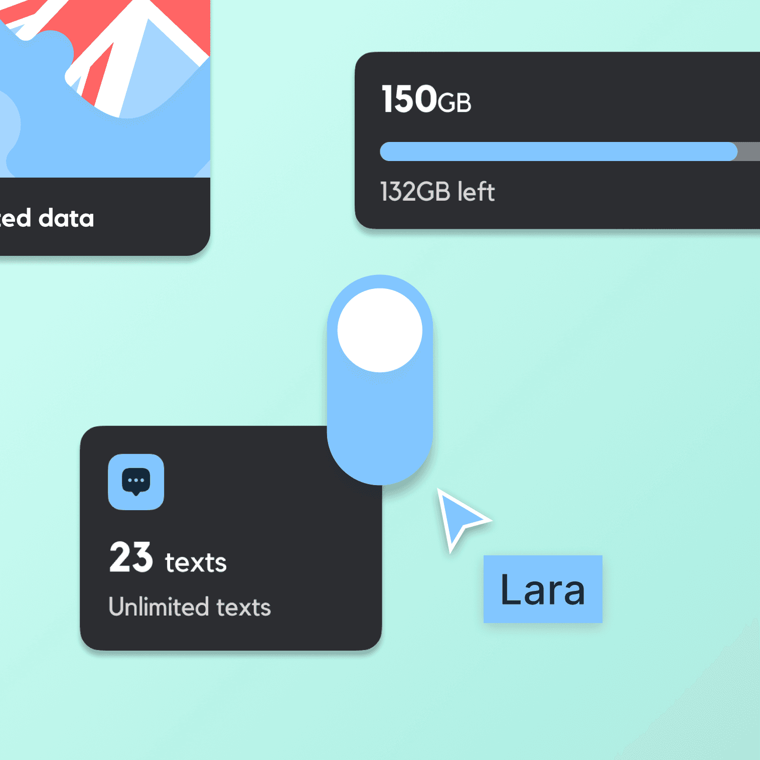
I defined tokens for colours, typography, spacing and radius. Here is where we started to bake in accessibility by contrast checking for AA WACAG compliance.
The token structure was made to be flexible using aliasing so if we needed to change tokens in future it would be easy to do.
This bit was challenging as I had to constantly change naming convention and tokens based on designer and developer feedback.

I scoped tokens in the DS so only certain tokens could be used on certain properties like background colour. I also used aliasing so the designers knew which token to apply to which component and its state.
Handing Off Tokens
To Development
Week 3 & 4
We wanted to ensure that what we designed was pixel perfect.
Myself and the developers ended up building a customised GTP model that would taken exported JSON tokens and parse them into platform specific code.

Output of custom GTP model that parsed JSON tokens into Kotlin data classes we can use in jetpack compose.
Building Responsive Components
Week 5 & 7
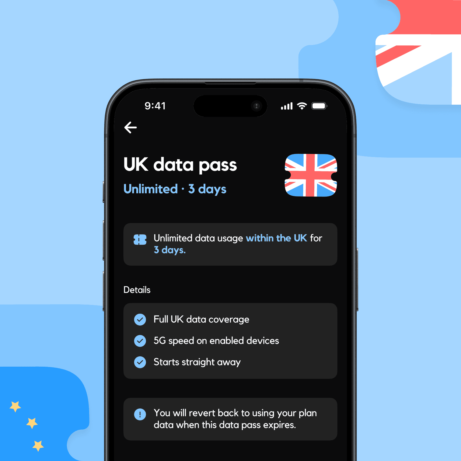
On the 5th week myself and the team rebuilt the entire DS in Figma to allow components to adapt and scale.
Responsive grid systems to cater the range of different form factors on web and app.
Design like a developer. We sat in on sessions and learned how they build UI in code and applied it to figma.
Implemented spacers, columns and rows as an developers would when laying out components.
Every component built to scale with accessible font sizes and tap targets.
Applied atomic principles to how we build components.
Considered different affordances for web and app components (click, tap & hover etc).
How responsive components behave in the new Figma DS.

AA accessible primary button component structure for Android.
Handing off figma components to
developers
Week 8
Myself and developers worked together to using different tools to take a component from figma and export it into either Web, Android & iOS.
This step automated a big process and sped-up hand-off significantly and ensured a 1:1 relationship between the component in figma and the one in the codebase.

How we turn Figma components into android components using relay.
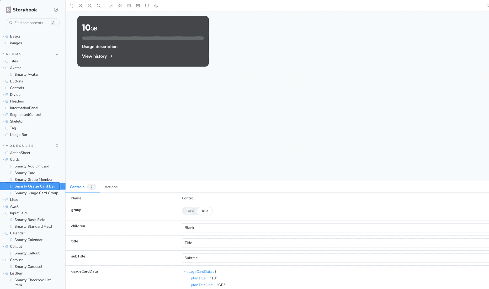
How we use Storybook to house our web components for the web team.